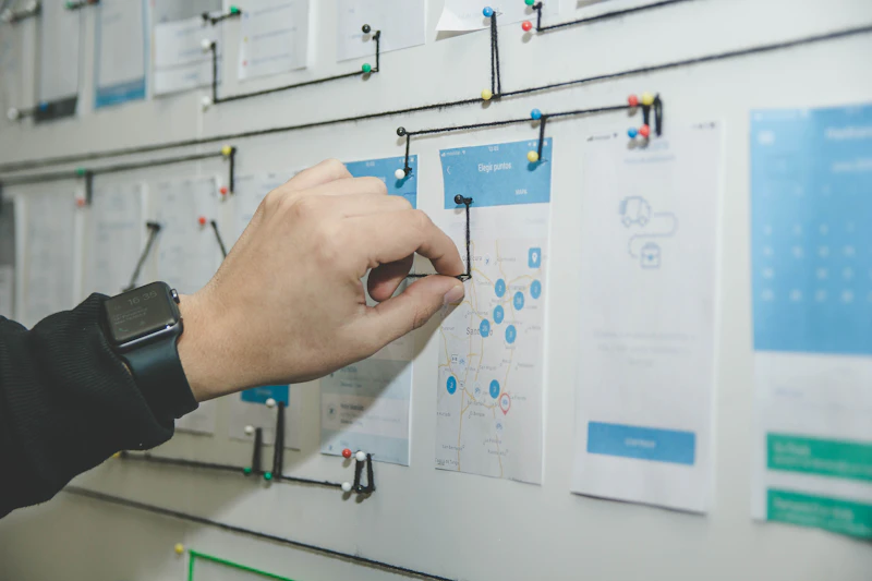
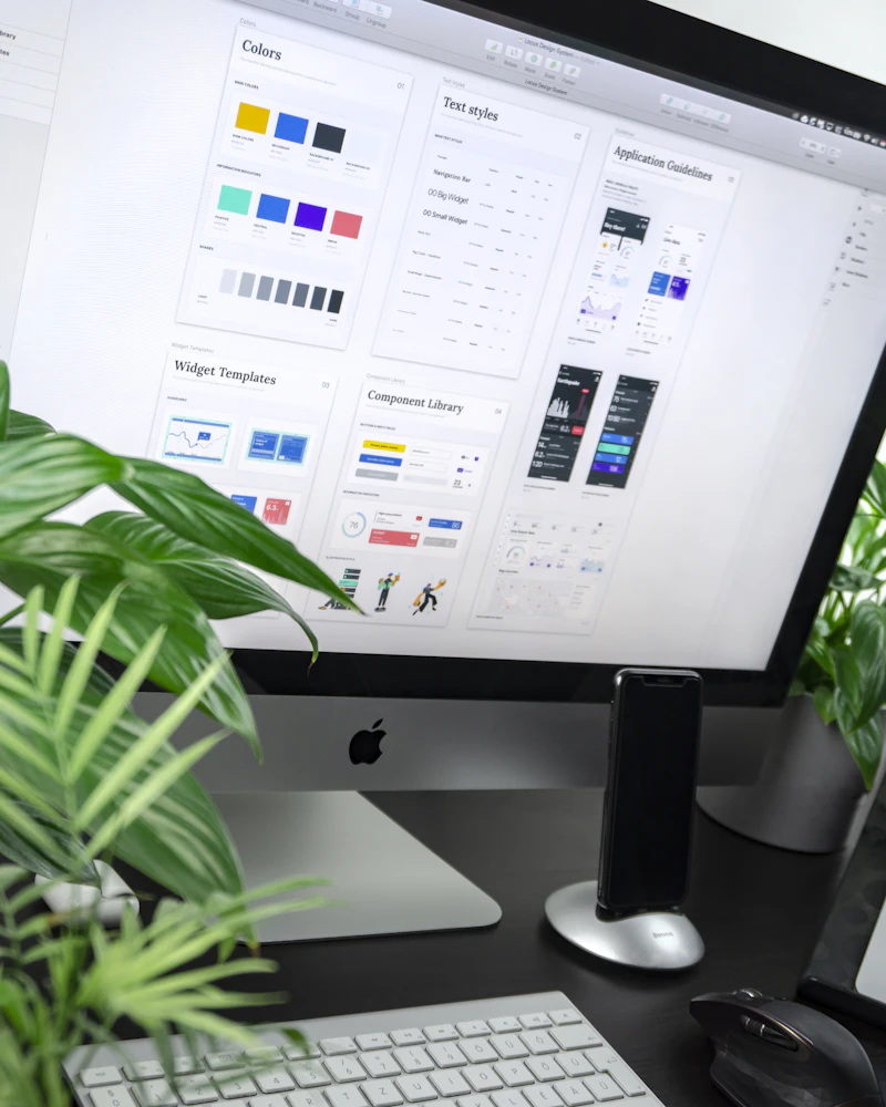
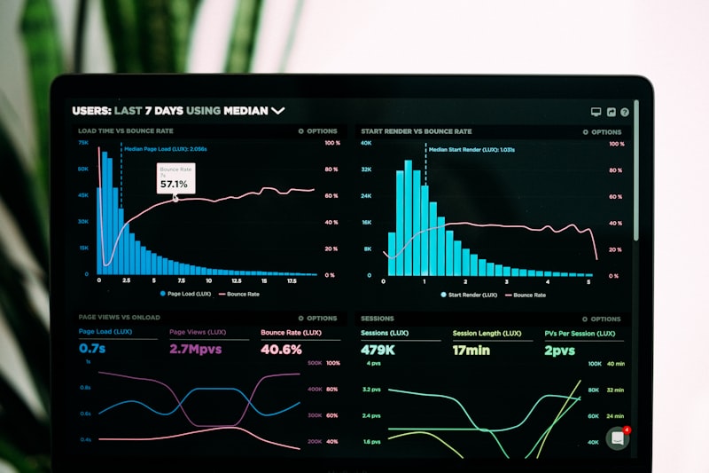
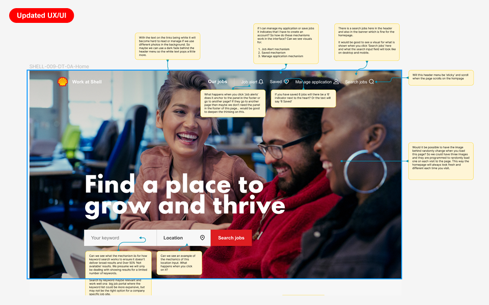
We design high performance websites and applications

UX/UI and product revenue design for startups and ambitious teams who want clarity, speed, and measurable impact.

Revenue-led design that moves the needle

We don't just make things look good — we design digital products that drive measurable business outcomes for ambitious teams.

Flexible design subscription — no contracts

Senior UX and product design on demand. Faster than hiring in-house, with no long-term commitments. Pause or cancel anytime.

Digital design offerings

We strip away the noise to deliver UX that works — clear, intuitive, built for real people.

UX Strategy

Experience design

We shape how users navigate websites, SaaS platforms and mobile apps — every interaction crafted for clarity and conversion.

Read more
Visual Design

Interface design

Clean, polished interfaces that feel as good as they look — crafted for clarity, brand consistency, and measurable performance.

Read more
End-to-End

Digital product design

From the first sketch to launch-ready screens — partnering with product teams to design digital experiences users love and businesses grow on.

Read more
Touchpoints

Service design

Designing end-to-end customer journeys and internal processes that create coherent, seamless experiences across every touchpoint.

Read more
Scale

Design systems

A great design system is the foundation of every great product. We build living, breathing systems your team can own and evolve without us.

Read more
Optimise

Product audit & UX review

A structured expert review of your existing product — identifying friction points, conversion blockers, and quick wins with a clear action plan.

Read more

Need everything, continuously?

Our monthly subscription gives you a dedicated senior design
team — no hiring, no overhead, no contracts.

Explore subscription →
The Treasury team
Meet the team

We're a
friendly bunch

Great design is a collaborative effort. We build long-term partnerships built on empathy, transparency and shared ambition.

Meet the design team

Trusted by teams who don't settle for average

Our digital design services →
Boots
Sainsbury’s
BT
Indeed
Tesco
Emaar
Post Office
Damac
DEWA
Shell
Haleon
Carrefour
The Dubai Mall
Aramtec
KAEC
Betterhomes
Federal Tax Authority
Rivoli
Sharjah
Boots
Sainsbury’s
BT
Indeed
Tesco
Emaar
Post Office
Damac
DEWA
Shell
Haleon
Carrefour
The Dubai Mall
Aramtec
KAEC
Betterhomes
Federal Tax Authority
Rivoli
Sharjah

Boots

Enhancing the ecommerce experience across one of the UK's most recognised health and beauty platforms.

Client
Boots
Location
United Kingdom
Services delivered
UX Design UI Design User Research Design System

Boots needed its ecommerce experience to be as intuitive, accessible, and commercially effective as its 170-year high-street reputation.

The challenge

Boots is the UK's leading health and beauty retailer — 170+ years of heritage, 2,000+ stores, and an ecommerce platform serving millions of customers every month.

At that scale, even small points of friction in search, navigation, and product discovery add up. The experience needed to be more intuitive and accessible without losing commercial impact.

Our approach

As part of the product design team, we focused on high-impact areas of Boots.com — working mobile-first through user research, wireframing, prototyping, and high-fidelity design.

Every change was made with accessibility and the existing design system in mind, so improvements scaled consistently across the platform.

A set of focused improvements across search, navigation, and guided product discovery.

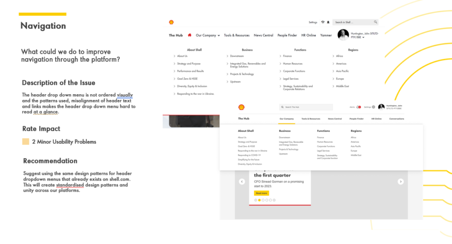
Key projects included a Pain Selector Tool that guided customers from symptom to the right product, a redesigned No Results page that turned dead-ends into useful next steps, and a new Global Header that clarified navigation and branding.

Each was designed mobile-first, validated through research, and built to evolve the design system — improving accessibility and commercial performance across Boots.com.

Projects shown include live work, pitch deliverables, and design produced as part of embedded or collaborative engagements. Some work was completed as part of a wider team. Deliverables reflect the scope and direction at the time of engagement — the live experience may have since changed, launched in a different form, or not proceeded to production. All brand assets and trademarks shown remain the property of their respective owners and are displayed here for portfolio reference only.

Boots — Pain Selector Tool
1 / 45
Slide 1
Slide 2
Slide 3
Slide 4
Slide 5
Slide 6
Slide 7
Slide 8
Slide 9
Slide 10
Slide 11
Slide 12
Slide 13
Slide 14
Slide 15
Slide 16
Slide 17
Slide 18
Slide 19
Slide 20
Slide 21
Slide 22
Slide 23
Slide 24
Slide 25
Slide 26
Slide 27
Slide 28
Slide 29
Slide 30
Slide 31
Slide 32
Slide 33
Slide 34
Slide 35
Slide 36
Slide 37
Slide 38
Slide 39
Slide 40
Slide 41
Slide 42
Slide 43
Slide 44
Slide 45
Boots — Global Header Upgrade
1 / 25
Cover
Overview
Section: Considerations
Considerations 1–2
Considerations 3–4
Considerations 5–6
Current Header States
Section: Key Focus Areas
Key Focus Areas Grid
Key Focus Areas Summary
Section: Challenges
Challenges 1–2
Challenges 3–6
Section: Heuristic Review
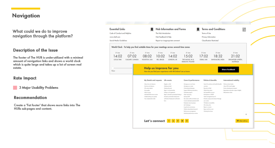
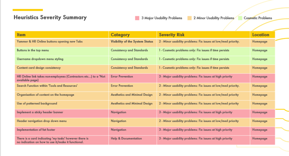
Heuristic Review: Signed In
Heuristic Review: Guest
Section: Design Exploration
Original vs. Suggested
Why the Update Works
Anatomy of Header
Section: Final Designs
Final Designs: Desktop
Final Designs: Tablet & Mobile
Key Takeaways
Thank You
Boots — No Results Page
1 / 36
Cover
Overview
Why It Matters 1–2
Why It Matters 3–5
Current Page
Section: Key Focus Areas
Key Focus Areas Grid
Key Focus Areas Summary
Section: Challenges
Challenges 1–2
Challenges 3–5
Section: Intelligence
Hypothesis & Insights
Test Results Summary
Recommendation Strategies
Carousels Data
Next Steps
Section: SEO Considerations
Error Page Specs
Section: Competitor Research
Competitors: Lloyds & Well
Competitors: Ocado & Sainsbury's
Competitor Takeaways
Section: Heuristic Review
Heuristic Review 1–2
Heuristic Review 3 & Recommendations
Heuristic Review Takeaways
Section: Design Experimentation
Concepts 1–2
Concept 3
Section: Final Designs
Final Designs: Signed In
Final Designs: Signed Out
Ready to Ship
Key Takeaways
Thank You
Boots — OOBO Checkout CSC Parity
1 / 21
Cover
Overview
Scope: Five Features
Section: Payment Options
Payment Options by Scenario
Screens: Default & Guest
Screens: Points Available & Insufficient
Section: Pay by Card
How Eckoh Flow Works
Screen: Card Capture
Section: Payment Threshold
Threshold: Within vs. Outside
Screen: Threshold Notification
Section: Error Scenarios
Error Scenarios Table
Screen: Error State
Section: Billing Address
Billing Address Scenarios
Screen: Billing Address
Key Takeaways
Thank You
Boots — Transactional Comms Emails
1 / 22
Cover
Overview
Scope: Email Scenarios
Design System Foundations
Section: Order Confirmation
Order Confirmation: Before & After
Order Confirmation: What We Fixed
Section: Account Creation
Account Creation: Before & After
Account Creation: What We Fixed
Section: Order Dispatch
Dispatch: Before & After
Dispatch: What We Fixed
Section: Ready to Collect
Collect: Before & After
Collect: What We Fixed
Section: Order Cancellation
Cancellation: Before & After
Cancellation: What We Fixed
Collaboration
Key Takeaways
Thank You
Boots — Lost & Stolen Advantage Card
1 / 17
Cover
Overview & Challenge
Process at a Glance
Discovery Inputs
Requirements at a Glance
Design Principles
Section: Removed Advantage Card
Removed Advantage Card: How It Works
Section: Replacement Plastic to Digital
Replacement Plastic to Digital: How It Works
Section: Replacement Digital to Digital
Replacement Digital to Digital: How It Works
Shared Content System
Engineering Handoff
Considerations & Edge Cases
Key Takeaways
Thank You
Boots — Age, Airports & Warranties
1 / 16
Cover
Overview & Challenge
Process at a Glance
Discovery Inputs
Requirements at a Glance
Design Principles
Section: Age Verification
Age Verification: How It Works
Section: Airport Collection
Airport Collection: How It Works
Section: Warranty Data
Warranty Data: How It Works
Engineering Handoff
Considerations & Edge Cases
Key Takeaways
Thank You

Constraints

Legacy platform architecture
The Boots.com frontend had significant legacy constraints. Components couldn't always be rebuilt from scratch — new designs had to work within existing technical boundaries while still improving the experience.
Design system governance
All new components needed to be compatible with the existing Boots design system. Deviating from established patterns required cross-team alignment before anything moved to development.
Regulatory & pharmacy requirements
The Pain Selector Tool touched healthcare product recommendations — which meant additional sign-off from the pharmacy and healthcare compliance team on copy, guidance, and product selection logic.

Trade-offs

Personalisation vs. speed
A more personalised tool would have required account data and longer sessions. The decision was made to keep it anonymous and fast — lower barrier to entry, wider reach, and no dependency on logged-in state.
Header scope vs. timeline
The header redesign surfaced additional opportunities in the mega-menu and category navigation. These were scoped out to keep the project deliverable within the engagement window — flagged as a follow-on workstream.
Consistency vs. differentiation
Some PST interaction patterns were genuinely new to Boots.com. Balancing innovation with system consistency required careful negotiation — introducing new patterns only where they clearly served the user better than existing ones.

Outcomes

19k+
Tool interactions
Pain Selector Tool interactions in April alone, up from ~4,200 in March — a 4.5× increase in a single month.
10×
Revenue growth
Revenue from tool-driven purchases grew 10× month-on-month between March and April after launch.
33%
Drop-off identified
Peak drop-off at the Pain Intensity step surfaced through analytics — became the primary redesign focus.
3×
Platforms covered
All designs delivered across desktop, tablet, and mobile — mobile-first throughout.
6
Major workstreams
Discovery, navigation, search, checkout, transactional communications, and compliance features — all delivered under the same engagement.
AA
Accessibility standard
All designs met WCAG 2.1 AA requirements — colour contrast, focus states, and touch targets validated throughout.

Reflection & what I'd do differently

The Pain Selector Tool performance data told a clear story: a 33% drop-off at the Pain Intensity step was the single biggest friction point. In hindsight, I'd have pushed to run qualitative research on that specific step earlier — the analytics surfaced the what, but understanding the why would have sharpened the redesign direction faster.

On the Global Header, deferring mega-menu improvements was commercially sensible, but it left a visible inconsistency between the updated header and navigation patterns behind it. I'd advocate harder for at least a light-touch review of adjacent components before handoff.

The OOBO checkout work reinforced how much edge-case thinking happens late in a project. Mapping error states and payment threshold scenarios earlier — before high-fidelity — would have reduced back-and-forth with engineering considerably.

The transactional email redesign was a reminder of how much design debt accumulates in low-visibility surfaces. These emails had never been properly aligned to the design system — the audit phase took longer than expected because the inconsistencies were more widespread than anyone had assumed. A periodic comms design review would catch drift earlier.

The Age, Airports, and Warranties work was the most cross-functional of the engagement — three compliance-driven features running near-simultaneously, each with distinct legal, operational, and engineering stakeholders. The lesson: in compliance work, getting legal sign-off on copy and logic early isn't a blocker to design progress, it's a prerequisite. Starting those conversations before design exploration would have saved iteration cycles.

Across all six workstreams, the most valuable design decisions weren't made in Figma — they were made in the conversations before it. Earlier stakeholder alignment on scope and success metrics consistently saved more time than any tool or process change.

"Johnny's work on the Pain Selector Tool was exactly what we needed — rigorous, commercially aware, and genuinely user-centred. He brought clarity to a complex problem and delivered something the whole team was proud of."
Product Manager, Boots.com
Ecommerce engagement
More in Ecommerce
See all Ecommerce work

Projects shown include live work, pitch deliverables, and design produced as part of embedded or collaborative engagements. Some work was completed as part of a wider team. Deliverables reflect the scope and direction at the time of engagement — the live experience may have since changed, launched in a different form, or not proceeded to production. All brand assets and trademarks shown remain the property of their respective owners and are displayed here for portfolio reference only.

Previous case study
Ecommerce
Tesco — Returns & Refunds
Next case study
Design Systems
Sainsbury's — Design System

Privacy settings

We use cookies to help our site work and to understand how visitors use it. Some are essential for core functionality and security; others — such as analytics — are only used with your consent.

E